Major Issues and Challenges Confronting Sustainable Development
Sustainable development refers to a pattern of development that meets the needs of the present without compromising the ability of future generations to meet their own needs. The concept gained global recognition after the report of the World Commission on Environment and Development (Brundtland Commission) in 1987. Sustainable development seeks to balance economic growth, social equity, and environmental protection. However, achieving this balance is difficult because many countries face multiple economic, environmental, and social challenges.
One of the most critical challenges to sustainable development is environmental degradation. Rapid industrialization, deforestation, pollution, and excessive use of natural resources have severely damaged ecosystems. Climate change has become a major global concern due to increasing greenhouse gas emissions. International efforts such as the Paris Agreement aim to limit global temperature rise, but implementation remains uneven across countries. For example, large-scale deforestation in the Amazon rainforest and air pollution in many Asian cities illustrate how economic activities often conflict with environmental sustainability.
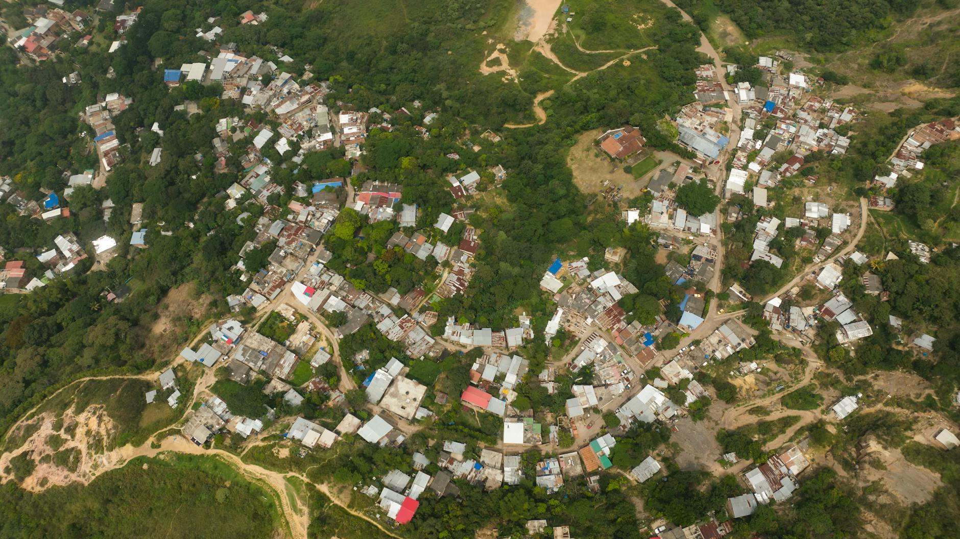
Another major issue is population growth and urbanization. Rapid population increase puts immense pressure on natural resources such as water, land, and energy. In developing countries, urban areas are expanding quickly, often without adequate planning. This results in overcrowding, traffic congestion, slums, and inadequate infrastructure. For instance, cities like Delhi experience severe air pollution, water shortages, and waste management problems due to rapid urban growth. Such issues highlight the difficulty of achieving sustainable urban development.
Poverty and inequality also pose serious barriers to sustainable development. A large portion of the global population still lacks access to basic services such as clean water, sanitation, healthcare, and education. Poor communities often rely heavily on natural resources for survival, which can lead to overexploitation of forests, land, and fisheries. Global initiatives such as the Sustainable Development Goals aim to reduce poverty and promote inclusive development, but disparities between developed and developing nations remain significant.
Another challenge is the unsustainable pattern of production and consumption. Modern economic systems encourage high levels of consumption, which increases waste generation and resource depletion. Industries rely heavily on fossil fuels, leading to environmental pollution and climate change. For example, excessive plastic consumption has resulted in severe marine pollution, affecting ocean ecosystems worldwide. Transitioning to renewable energy and adopting circular economy principles are essential but require significant policy support and investment.
Governance and policy implementation are also important issues. Many governments lack the institutional capacity, political will, or financial resources needed to implement sustainable development policies effectively. Corruption, weak regulatory frameworks, and poor coordination among agencies often hinder environmental protection and social welfare programs. For example, despite various environmental laws, illegal mining and deforestation continue in many regions due to weak enforcement mechanisms.
Finally, technological and financial constraints present significant obstacles, particularly for developing countries. Sustainable technologies such as renewable energy systems, electric mobility, and efficient waste management require substantial investment. Many countries struggle to mobilize the financial resources necessary for green infrastructure and sustainable urban planning.
In conclusion, sustainable development faces numerous challenges, including environmental degradation, population growth, poverty, unsustainable consumption, governance issues, and financial constraints. Addressing these challenges requires integrated policies, international cooperation, technological innovation, and active participation from governments, industries, and communities. Only through coordinated efforts can societies achieve a balance between economic development, social well-being, and environmental sustainability for present and future generations.
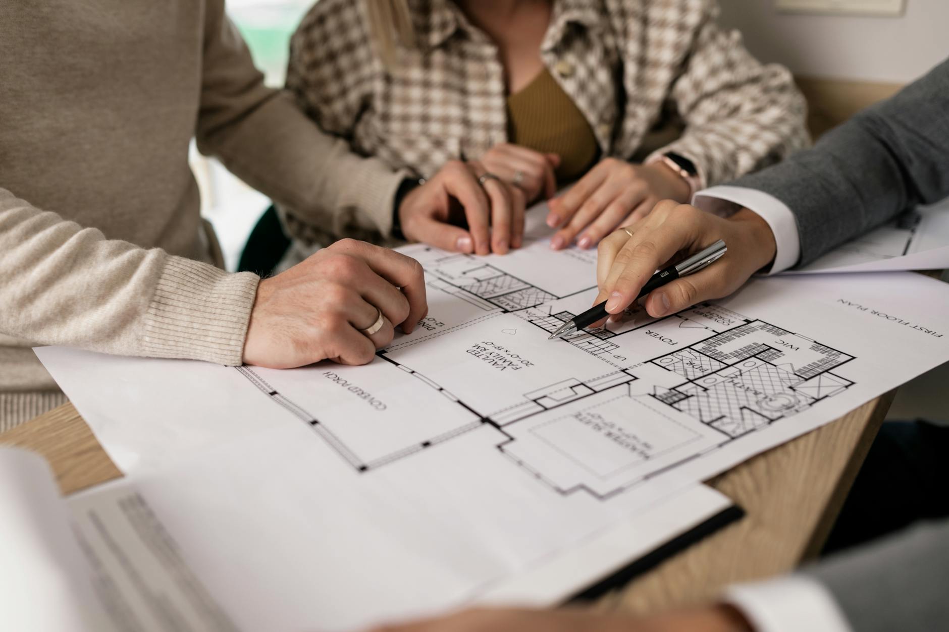
In construction and planning projects, accurate estimation of materials, labor, and costs is essential for successful project implementation. Quantity surveying and writing specifications are two important components of construction management that help ensure efficiency, cost control, and quality in building projects.
Quantity surveying involves the measurement and estimation of quantities of materials and resources required for construction, while specifications describe the quality, standards, and procedures to be followed during construction. Together, they provide a clear framework for project planning, cost estimation, and execution.
Quantity surveying can be defined as the process of estimating and managing the quantities and costs of materials, labor, and equipment required for construction projects.
It involves measuring construction work, preparing cost estimates, and controlling project expenses to ensure that construction projects are completed within the planned budget.
Quantity surveyors play an important role in construction projects by assisting architects, engineers, and planners in estimating project costs and managing financial resources.
3. Significance of Quantity Surveying
Quantity surveying is important for several reasons in construction and development projects.
Cost Estimation
One of the primary functions of quantity surveying is to prepare accurate cost estimates for construction projects. These estimates help determine the financial feasibility of the project.
Budget Control
Quantity surveying helps control construction costs by monitoring expenditures and ensuring that projects remain within the allocated budget.
Efficient Resource Management
Accurate measurement of materials and labor helps prevent wastage and ensures efficient use of resources.
Preparation of Tender Documents
Quantity surveying helps prepare tender documents such as Bills of Quantities (BOQ), which are used by contractors to submit competitive bids.
Project Planning
Estimating quantities and costs allows planners and engineers to schedule construction activities effectively.
Financial Transparency
Clear cost estimates and quantity measurements improve transparency in construction contracts and financial transactions.
4. Methods of Quantity Surveying
Several methods are used for estimating quantities and costs in construction projects. The choice of method depends on the type of project and the level of detail required.
4.1 Approximate Estimation
Approximate estimation is used in the early stages of planning to determine rough cost estimates. It is useful for assessing the feasibility of projects.
Common approximate estimation methods include:
Plinth area method
Cubic content method
Unit area method
These methods provide preliminary cost estimates without detailed measurements.
4.2 Detailed Quantity Estimation
Detailed estimation involves calculating the exact quantities of materials required for construction based on architectural and engineering drawings.
Steps involved include:
Measuring dimensions from drawings
Calculating quantities of materials such as concrete, bricks, steel, and timber
Preparing a detailed cost estimate
Detailed estimation provides accurate information about construction requirements.
4.3 Bill of Quantities (BOQ)
The Bill of Quantities is a document that lists all materials, labor, and work items required for a construction project along with their estimated quantities.
It helps contractors understand the scope of work and prepare cost estimates for tender submissions.
4.4 Rate Analysis
Rate analysis is used to determine the cost of individual construction items by considering the cost of materials, labor, equipment, and overhead expenses.
5. Specifications in Construction
Definition
Specifications are written documents that describe the quality, standards, materials, and methods to be used in construction work.
They provide detailed instructions regarding how construction work should be executed to ensure that it meets required standards and quality requirements.
Specifications form an essential part of construction contracts and help ensure consistency and quality in building projects.
6. Significance of Writing Specifications
Writing clear and detailed specifications is important for several reasons.
Ensuring Quality Standards
Specifications define the quality of materials and workmanship required in the construction project.
Avoiding Misunderstandings
Clear specifications help prevent misunderstandings between clients, architects, engineers, and contractors.
Legal Documentation
Specifications form part of the contract documents and help resolve disputes between parties involved in construction.
Guiding Construction Work
Specifications provide detailed guidelines for contractors regarding construction methods and procedures.
Facilitating Inspection and Supervision
Engineers and supervisors use specifications as a reference to check whether construction work meets the required standards.
7. Types of Specifications
Specifications can be classified into different types based on the level of detail provided.
General Specifications
General specifications provide a broad description of materials and workmanship required for construction.
They outline the general quality standards but do not provide detailed technical information.
Detailed Specifications
Detailed specifications provide comprehensive information about construction materials, methods, dimensions, and standards.
They are used for preparing accurate cost estimates and ensuring quality control.
Standard Specifications
Standard specifications are prepared by government agencies or professional organizations and provide standardized guidelines for construction materials and procedures.
8. Components of Specifications
A well-written specification typically includes the following components:
Description of materials to be used
Quality standards and testing requirements
Construction methods and procedures
Safety requirements
Measurement and payment procedures
These components ensure that construction work is carried out according to defined standards.
9. Relationship Between Quantity Surveying and Specifications
Quantity surveying and specifications are closely related in construction management.
Quantity surveying determines how much material and labor are required, while specifications describe the quality and standards of those materials and work processes.
Together, they help:
Prepare accurate cost estimates
Ensure quality construction
Facilitate effective project management
Maintain transparency in contracts
10. Conclusion
Quantity surveying and writing specifications are essential components of construction planning and management. Quantity surveying helps estimate and control construction costs by measuring materials and resources required for projects. Writing specifications ensures that construction work meets the required quality standards and technical requirements.
Both processes contribute to efficient project planning, cost management, and quality control in construction projects. By providing clear guidelines for materials, labor, and construction methods, quantity surveying and specifications play a crucial role in ensuring successful and sustainable development projects.
India is experiencing rapid social and economic transformation due to population growth, industrialization, and urbanization. While cities are expanding rapidly, rural areas continue to support a large proportion of the population through agriculture and natural resource-based livelihoods. Both urban and rural areas face unique challenges that affect development and quality of life.
Urban problems arise mainly due to rapid and unplanned urban growth, while rural development issues are often related to poverty, lack of infrastructure, and limited economic opportunities. Effective planning and policy interventions are necessary to address these challenges and ensure balanced development between urban and rural areas.
Urban problems refer to the difficulties faced by cities and towns due to rapid population growth, inadequate infrastructure, and inefficient planning. These problems affect the quality of life of urban residents and hinder sustainable urban development.
2.1 Housing Shortage and Slums
One of the most serious urban problems in India is the shortage of affordable housing. Rapid migration from rural areas increases demand for housing in cities. When housing supply is insufficient, many people live in informal settlements or slums.
Slums often lack basic facilities such as:
Safe drinking water
Sanitation systems
Proper drainage
Electricity and waste management
These conditions lead to unhealthy living environments.
2.2 Traffic Congestion
The rapid increase in the number of vehicles combined with inadequate transportation infrastructure has resulted in severe traffic congestion in many cities.
Urban transportation problems include:
Long travel times
Road accidents
Increased fuel consumption
Air pollution
Improving public transportation systems and promoting sustainable mobility are important planning priorities.
2.3 Inadequate Infrastructure
Urban infrastructure such as water supply, sewage systems, drainage networks, and solid waste management often fails to keep pace with population growth.
Common infrastructure challenges include:
Water shortages
Poor sanitation
Flooding due to inadequate drainage
Improper waste disposal
These issues affect public health and environmental quality.
2.4 Environmental Pollution
Urban areas are major sources of environmental pollution. Rapid industrialization and increased vehicle use contribute to air pollution, while untreated waste and sewage pollute water bodies.
Major environmental concerns include:
Air pollution
Water pollution
Noise pollution
Solid waste accumulation
Environmental degradation reduces urban livability and threatens public health.
2.5 Urban Poverty and Unemployment
Despite economic growth, many urban residents work in the informal sector with low wages and limited job security. Urban poverty often results in poor living conditions and limited access to education and healthcare.
Unemployment and underemployment remain major concerns in many cities.
2.6 Urban Sprawl
Unplanned expansion of cities into surrounding rural areas leads to urban sprawl. This results in inefficient land use, loss of agricultural land, and increased transportation costs.
Urban sprawl also increases the demand for infrastructure and public services.
3. Rural Development Issues
Rural areas in India face several development challenges due to limited economic opportunities, poor infrastructure, and dependence on agriculture.
3.1 Agricultural Challenges
Agriculture is the main source of livelihood in rural areas. However, farmers face problems such as:
Low agricultural productivity
Dependence on rainfall
Limited irrigation facilities
High cost of inputs
Fluctuating market prices
These factors contribute to rural poverty and economic instability.
3.2 Lack of Infrastructure
Many rural areas lack adequate infrastructure and basic services. Key issues include:
Poor road connectivity
Limited access to electricity
Inadequate water supply
Poor sanitation facilities
Lack of healthcare and education services
Improving rural infrastructure is essential for development.
3.3 Poverty and Unemployment
Rural poverty remains a major issue in many parts of India. Limited employment opportunities outside agriculture lead to seasonal unemployment and underemployment.
Many rural residents migrate to cities in search of better economic opportunities.
3.4 Lack of Educational and Healthcare Facilities
Rural areas often have limited access to quality education and healthcare services. Schools and hospitals may be located far from villages, making it difficult for residents to access these services.
Improving rural education and healthcare systems is important for human development.
3.5 Environmental Degradation
Overuse of land and natural resources in rural areas can lead to environmental problems such as:
Soil erosion
Deforestation
Water scarcity
Sustainable management of natural resources is essential for long-term rural development.
4. Rural–Urban Migration
One of the major consequences of rural development issues is migration from villages to cities. People move to urban areas in search of employment, education, healthcare, and better living conditions.
This migration contributes to:
Population growth in cities
Increased demand for housing and services
Expansion of informal settlements
Balanced development strategies are needed to reduce excessive migration pressures.
5. Planning Strategies to Address Urban and Rural Issues
Effective planning and policy interventions are required to address both urban and rural development challenges.
Urban Planning Strategies
Development of affordable housing programs
Expansion of public transportation systems
Improvement of urban infrastructure and services
Promotion of sustainable land-use planning
Protection of urban green spaces
Rural Development Strategies
Improvement of agricultural productivity
Development of rural industries and employment opportunities
Expansion of rural infrastructure and connectivity
Strengthening of education and healthcare systems
Promotion of sustainable natural resource management
Integrated development approaches can help reduce disparities between urban and rural areas.
6. Government Initiatives
The Government of India has launched several programs to address urban and rural development challenges.
Examples include:
Urban Programs
Smart Cities Mission
AMRUT (Atal Mission for Rejuvenation and Urban Transformation)
Pradhan Mantri Awas Yojana (Urban)
Rural Programs
MGNREGA (Mahatma Gandhi National Rural Employment Guarantee Act)
Pradhan Mantri Awas Yojana (Gramin)
National Rural Livelihood Mission
These initiatives aim to improve infrastructure, employment, housing, and service delivery.
7. Conclusion
Urban and rural areas in India face different but interconnected challenges. Urban problems include housing shortages, traffic congestion, infrastructure deficiencies, environmental pollution, and urban poverty. Rural development issues include agricultural challenges, lack of infrastructure, unemployment, limited access to services, and environmental degradation.
Addressing these issues requires integrated planning strategies that promote balanced development between urban and rural areas. By improving infrastructure, creating employment opportunities, and promoting sustainable resource management, planners and policymakers can enhance the quality of life for both urban and rural populations.
Geometric projection is a fundamental concept in engineering drawing, architecture, urban planning, and design. It is the method used to represent three-dimensional objects on a two-dimensional surface such as paper or a computer screen. Since physical objects exist in three dimensions—length, width, and height—various projection techniques are used to visually communicate their shape, size, and spatial relationships accurately.
Geometric projections are essential tools for architects, planners, engineers, and designers because they allow complex objects and structures to be represented clearly and precisely. These projections help in visualizing objects, preparing construction drawings, and communicating design ideas effectively.
The three most widely used geometric projection methods are:
Orthographic Projection
Isometric Projection
Perspective Projection
Each method has a different purpose and provides a different way of representing objects.
2. Concept of Dimensional Objects
Before understanding projection techniques, it is important to understand the dimensional classification of objects.
2.1 One-Dimensional Objects (1D)
One-dimensional objects have only length and no measurable width or height. In geometric representation, they are usually represented as lines or edges.
Examples include:
A straight line
Edges of a cube
Axis of a cylinder
In projections, one-dimensional elements appear as lines or points depending on orientation.
2.2 Two-Dimensional Objects (2D)
Two-dimensional objects have length and width but no thickness.
Examples include:
Square
Rectangle
Triangle
Circle
Plane surfaces
In projection drawings, these shapes are often represented as faces of three-dimensional objects.
2.3 Three-Dimensional Objects (3D)
Three-dimensional objects have length, width, and height.
Examples include:
Cube
Cylinder
Sphere
Pyramid
Building forms
Projection techniques help represent these objects accurately on flat surfaces.
3. Orthographic Projection
3.1 Definition
Orthographic projection is a method of representing a three-dimensional object using multiple two-dimensional views. Each view shows the object from a different direction such as the front, top, or side.
In orthographic projection, the projectors (imaginary lines from the object to the drawing plane) are perpendicular to the projection plane.
This technique is widely used in:
Engineering drawings
Architectural plans
Mechanical design
Construction documentation
3.2 Types of Orthographic Views
The most common orthographic views are:
Front View (Elevation)
Top View (Plan)
Side View (Profile)
These views together provide complete information about the object’s shape and dimensions.
For example, in architectural drawings:
Plan shows the layout from above.
Elevation shows the vertical appearance.
Section reveals internal features.
3.3 Orthographic Projection of Objects
1D Object in Orthographic Projection
A line may appear:
As a true line if parallel to the projection plane
As a point if perpendicular to the plane
2D Object in Orthographic Projection
A plane surface may appear:
In true shape when parallel to the projection plane
As a line when perpendicular to the projection plane
3D Object in Orthographic Projection
A cube, prism, or cylinder will be represented through multiple views, each describing a specific face.
For example:
Cube → square in front view, square in top view
Cylinder → rectangle in elevation, circle in plan
3.4 Advantages of Orthographic Projection
Accurate representation of dimensions
Essential for construction and manufacturing
Eliminates distortion
Allows precise measurement
3.5 Limitations
Difficult for beginners to visualize the object
Requires multiple drawings to represent one object
4. Isometric Projection
4.1 Definition
Isometric projection is a type of pictorial projection where a three-dimensional object is represented in a single drawing.
In this projection:
The three principal axes (length, width, height) are 120° apart
The object is viewed from a corner
All dimensions are shown simultaneously
This projection helps visualize the object more easily than orthographic projection.
4.2 Characteristics of Isometric Projection
Key characteristics include:
All axes are equally inclined at 120°
Vertical lines remain vertical
Horizontal edges appear at 30° to the horizontal
All three dimensions are visible simultaneously
Isometric drawings are commonly used in:
Product design
Technical illustrations
Architectural sketches
4.3 Isometric Projection of Objects
1D Object
A line is drawn along one of the isometric axes.
2D Object
A square in isometric projection becomes a rhombus (parallelogram).
Example: A square plate when drawn in isometric form appears as a diamond-shaped plane.
3D Object
Three-dimensional objects such as cubes, cylinders, and prisms can be easily represented.
Examples:
Cube → appears as a three-faced object
Cylinder → appears as a rectangle with elliptical top
Pyramid → appears as triangular faces converging to a point
4.4 Advantages of Isometric Projection
Shows three dimensions in a single drawing
Easy to visualize objects
Useful for presentation and conceptual design
Quick representation
4.5 Limitations
Not suitable for exact measurement
Circles appear as ellipses
Slight distortion occurs
5. Perspective Projection
5.1 Definition
Perspective projection is the method of representing objects as they appear to the human eye.
In perspective projection:
Lines converge towards a vanishing point
Objects farther away appear smaller
Depth and realism are emphasized
This projection is widely used in:
Architecture
Urban design
Interior design
Landscape visualization
5.2 Components of Perspective Projection
Important elements include:
Picture Plane (PP) – the imaginary surface where the image is projected.
Station Point (SP) – the observer’s eye position.
Ground Line (GL) – the intersection of the ground plane and picture plane.
Horizon Line (HL) – represents eye level.
Vanishing Point (VP) – point where parallel lines appear to converge.
5.3 Types of Perspective Projection
One-Point Perspective
Only one vanishing point
Used when viewing an object directly from the front
Example:
A corridor
Railway track
Two-Point Perspective
Two vanishing points
Used when viewing an object from a corner
Common in architectural drawings of buildings.
Three-Point Perspective
Three vanishing points
Used for tall buildings or aerial views
Provides dramatic visual depth.
5.4 Perspective Projection of Objects
1D Object
A line receding from the observer converges toward a vanishing point.
2D Object
Plane surfaces appear smaller as they move away from the viewer.
3D Object
Three-dimensional objects appear realistic with depth and foreshortening.
Example: A cube in perspective shows:
Front face larger
Rear edges converging
5.5 Advantages of Perspective Projection
Realistic representation
Easy for viewers to understand
Shows depth and spatial relationships
5.6 Limitations
Difficult to measure dimensions
Requires more drawing skill
Not suitable for technical documentation
6. Comparison of Projection Methods
Feature
Orthographic Projection
Isometric Projection
Perspective Projection
Number of Views
Multiple views
Single view
Single realistic view
Dimensional Accuracy
Very accurate
Moderately accurate
Not accurate
Realism
Low
Moderate
High
Usage
Engineering drawings
Technical illustrations
Architectural visualization
Distortion
None
Slight
Significant
7. Applications in Architecture and Planning
Geometric projections are widely used in architecture, urban planning, and engineering.
Orthographic Projection Applications
Building plans
Elevations
Sections
Structural drawings
Isometric Projection Applications
Conceptual building models
Furniture design
Urban layout sketches
Perspective Projection Applications
Architectural presentations
Urban design visualization
Landscape design
Interior design presentations
For planners and architects, the combination of these projections allows accurate technical documentation as well as effective visual communication.
8. Conclusion
Geometric projections are essential techniques used to represent objects in design and engineering. Orthographic projection provides accurate and measurable views necessary for construction and manufacturing. Isometric projection allows three-dimensional visualization in a single drawing, making it useful for conceptual representation. Perspective projection provides realistic images that resemble human vision and is widely used in architectural visualization.
Understanding the principles of these projections helps architects, engineers, and planners communicate ideas effectively and translate design concepts into practical solutions. By mastering orthographic, isometric, and perspective projections, designers can accurately represent one-dimensional, two-dimensional, and three-dimensional objects for both technical documentation and visual presentation.
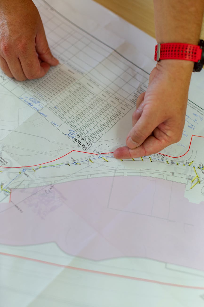
Graphic communication plays a crucial role in urban and regional planning. Planners often deal with complex spatial information such as land-use distribution, transportation networks, environmental resources, and infrastructure systems. To communicate these ideas effectively, planners rely on graphic applications, including maps, diagrams, charts, and conceptual drawings. These graphics simplify complex information and make planning proposals understandable for policymakers, professionals, and the general public.
The effective use of lines, colours, symbols, textures, and composition is fundamental in planning graphics. These elements help planners represent spatial relationships, identify patterns, and convey planning proposals clearly. This tutorial explains how these graphical elements are applied in planning practice and how students and professionals can use them effectively.
1. Importance of Graphics in Planning
Urban planning is inherently spatial. Decisions about land use, transportation, infrastructure, and environmental management depend on spatial relationships between different elements of the city or region. Graphic representation allows planners to visualize these relationships and communicate them to others.
Graphics in planning are used for several purposes:
Representing existing conditions such as land use, population distribution, and natural features
Illustrating planning proposals and development scenarios
Communicating policy frameworks and design guidelines
Presenting transport networks and infrastructure systems
Supporting public participation and decision-making
A well-designed graphic can communicate complex planning ideas more effectively than long written descriptions.
2. Use of Lines in Planning Graphics
Lines are one of the most basic yet powerful graphic elements. They define boundaries, indicate movement, and organize spatial information. Different types of lines convey different meanings.
Boundary Lines
Boundary lines are used to show limits such as:
City boundaries
Land-use zones
Administrative limits
Plot boundaries
These lines are usually drawn with thicker strokes so they are clearly visible.
Transportation Lines
Lines are commonly used to represent transportation networks such as roads, railways, and pedestrian pathways. Different line styles can differentiate between transport modes:
Solid lines for major roads
Double lines for highways
Dashed lines for proposed roads
Thin lines for minor streets
Curved lines for railway tracks
By varying line thickness and style, planners can represent hierarchies within transportation systems.
Flow Lines
Flow lines represent movement patterns such as traffic flow, pedestrian movement, or migration patterns. These lines may include arrows to indicate direction.
For example:
Arrow lines can indicate traffic direction.
Curved arrows may represent travel demand between two zones.
Environmental Features
Lines can also represent natural features such as:
Rivers and streams
Contours and elevation lines
Green corridors and ecological networks
In these cases, lines often follow natural curves to reflect the organic shape of landscapes.
3. Use of Colours in Planning Graphics
Colours play an essential role in planning maps and diagrams because they help differentiate between different categories and highlight important features. Proper colour selection improves clarity and readability.
Land Use Representation
Colours are widely used to represent different land uses. Standard colour conventions often include:
Yellow – Residential areas
Red – Commercial areas
Purple or magenta – Mixed-use areas
Blue – Water bodies
Green – Parks, forests, and open spaces
Grey or brown – Industrial areas
These colour conventions help viewers quickly understand the land-use pattern of a city.
Environmental Representation
Green and blue colours are commonly used for natural elements:
Green indicates vegetation, parks, and ecological zones.
Blue represents rivers, lakes, and water bodies.
These colours visually reinforce the connection between nature and environmental sustainability.
Transportation Networks
Transportation networks may be represented using contrasting colours:
Black or dark grey for roads
Red or orange for major highways
Blue lines for metro or railway networks
Green lines for cycling routes
Colour differentiation makes it easier to identify transportation modes and hierarchies.
Highlighting Important Areas
Bright colours can be used to emphasize key planning proposals, redevelopment zones, or special planning areas. However, excessive use of strong colours should be avoided because it can reduce clarity.
4. Use of Symbols and Icons
Symbols simplify complex information and make maps easier to interpret. Planning maps often include symbols representing different facilities or services.
Examples include:
Hospital symbol for healthcare facilities
School icon for educational institutions
Tree symbol for green spaces
Bus icon for public transport stations
Industrial gear symbol for industrial zones
Symbols allow planners to represent facilities without overcrowding the map with text.
5. Use of Patterns and Textures
Patterns and textures help differentiate areas when colour use is limited, such as in black-and-white maps.
Examples include:
Diagonal lines for industrial areas
Dots or stippling for recreational areas
Cross-hatching for restricted zones
Wavy patterns for water bodies
Textures are particularly useful for printed reports where colour printing may not be available.
6. Scale and Proportion in Planning Graphics
Scale determines how much detail can be shown in a graphic. Planning graphics may be prepared at different scales depending on the purpose.
Examples include:
Regional scale maps showing transportation corridors and metropolitan growth
City-level maps showing land-use patterns and infrastructure networks
Neighbourhood plans showing block structure and local facilities
Site plans showing building layouts and landscape features
Maintaining correct proportions ensures that spatial relationships are represented accurately.
7. Composition and Layout
Graphic composition refers to the arrangement of elements on a page or digital screen. Good composition ensures that the graphic is easy to read and visually balanced.
Important components of a planning graphic include:
Title explaining the purpose of the map
Legend explaining colours, lines, and symbols
Scale bar indicating distance
North arrow showing orientation
Labels and annotations identifying key features
These elements help viewers interpret the graphic correctly.
8. Digital Tools for Planning Graphics
Modern planners often use digital tools to produce graphics. Common software includes:
GIS software (ArcGIS, QGIS) for spatial mapping
AutoCAD for technical drawings and plans
Adobe Illustrator for graphic refinement
SketchUp for 3D visualizations
Photoshop for visual presentations
These tools allow planners to combine spatial data with graphic design principles to produce professional-quality visualizations.
9. Application in Planning Practice
Graphic applications are widely used in different areas of planning practice.
Land Use Planning
Planners use coloured maps and diagrams to represent zoning patterns, growth areas, and development restrictions.
Transportation Planning
Lines and arrows are used to represent transport networks, traffic flows, and mobility corridors.
Environmental Planning
Graphics show ecological networks, watershed boundaries, and green infrastructure systems.
Urban Design
Conceptual diagrams illustrate public spaces, pedestrian networks, and building relationships.
In all these cases, graphics help translate technical planning concepts into accessible visual formats.
10. Best Practices for Planning Graphics
To create effective planning graphics, planners should follow several guidelines:
Maintain clarity and simplicity in design
Use consistent colour conventions
Avoid overcrowding the map with excessive information
Ensure that legends and labels are clearly readable
Use contrasting colours to improve visibility
Maintain proper scale and proportion
Following these principles ensures that graphics communicate planning ideas effectively.
Conclusion
Graphic applications are essential tools for planners because they transform complex spatial information into clear visual representations. The effective use of lines, colours, symbols, textures, and layout helps planners communicate ideas about land use, transportation, environmental management, and urban development.
Lines define boundaries and networks, colours differentiate land uses and highlight important features, and symbols simplify information. Together, these graphic elements enable planners to present planning proposals in a clear and engaging manner.
As cities become more complex and planning challenges grow, the ability to communicate ideas visually will remain a fundamental skill for planners. Mastering graphic applications not only improves professional presentations but also enhances public understanding of planning processes and promotes better decision-making in the development of sustainable cities.
Planning approaches determine how decisions are made and implemented in the development process. In development planning, particularly in urban and rural planning, two major approaches are commonly discussed: the Top-Down approach and the Bottom-Up approach. These approaches differ mainly in terms of decision-making authority, participation of stakeholders, and implementation methods.
The top-down approach focuses on centralized decision-making by higher authorities, whereas the bottom-up approach emphasizes participation and involvement of local communities in planning processes. Both approaches have advantages and limitations, and modern planning practices often try to combine elements of both to achieve effective and inclusive development.
2. Top-Down Approach
Definition
The Top-Down approach refers to a planning method where decisions are made by higher authorities such as national governments, central planning agencies, or senior administrators, and then implemented at lower levels such as states, districts, cities, or villages.
In this approach, policies, strategies, and development programs are designed at the top level and passed down to lower administrative levels for execution.
Characteristics of the Top-Down Approach
Decision-making is centralized.
Planning policies are developed by higher authorities or experts.
Local communities have limited participation in decision-making.
Implementation occurs through government institutions and administrative systems.
Emphasis is placed on large-scale national or regional development goals.
Examples
Examples of top-down planning include:
National development policies formulated by central governments.
Large infrastructure projects such as highways, dams, and industrial corridors planned at national or state levels.
Early Five-Year Plans in India where development priorities were determined by central planning authorities.
Advantages of the Top-Down Approach
Efficient Decision-Making Centralized planning allows faster decision-making and implementation of large-scale projects.
Availability of Expertise Experts and planners with specialized knowledge can design comprehensive policies.
Coordination Across Regions It helps coordinate development across multiple regions and sectors.
Strategic National Planning Important for national development strategies such as infrastructure expansion and economic policies.
Limitations of the Top-Down Approach
Limited involvement of local communities.
Plans may not reflect local needs and priorities.
Risk of bureaucratic delays.
Implementation challenges at local levels due to lack of community participation.
3. Bottom-Up Approach
Definition
The Bottom-Up approach is a planning method where local communities, grassroots organizations, and local governments actively participate in the planning process. In this approach, development ideas originate from the local level and are gradually integrated into higher-level planning frameworks.
The bottom-up approach emphasizes community participation and local knowledge.
Characteristics of the Bottom-Up Approach
Planning begins at the grassroots level.
Local communities identify their needs and priorities.
Decision-making is decentralized.
Strong participation of stakeholders.
Plans reflect local social, economic, and environmental conditions.
Examples
Examples of bottom-up planning include:
Village development plans prepared by local communities.
Participatory rural development programs.
Local area planning initiatives in urban neighborhoods.
In India, the Panchayati Raj system encourages bottom-up planning through village-level governance.
Advantages of the Bottom-Up Approach
Community Participation Local residents participate in decision-making and planning processes.
Better Understanding of Local Needs Local communities have better knowledge of their problems and priorities.
Greater Accountability Community involvement increases transparency and accountability in development projects.
Sustainable Development Local ownership of projects improves long-term sustainability.
Limitations of the Bottom-Up Approach
Lack of technical expertise at local levels.
Limited financial and administrative resources.
Coordination challenges between local and higher-level planning institutions.
Possible conflicts between different community interests.
4. Comparison Between Top-Down and Bottom-Up Approaches
Aspect
Top-Down Approach
Bottom-Up Approach
Decision-making
Centralized
Decentralized
Participation
Limited community involvement
Strong community participation
Planning level
National or regional level
Local or grassroots level
Implementation
Government-driven
Community-driven
Flexibility
Less flexible
More adaptable to local needs
5. Integrated Planning Approach
Modern planning practices increasingly recognize the importance of combining both approaches.
An integrated planning approach allows:
Strategic direction from higher authorities.
Active participation from local communities.
Coordination between different levels of governance.
This combination ensures that development policies are both technically sound and socially inclusive.
6. Conclusion
The top-down and bottom-up approaches represent two different methods of planning and development. The top-down approach relies on centralized decision-making and expert-driven policies, while the bottom-up approach emphasizes community participation and decentralized planning.
Both approaches have their advantages and limitations. While top-down planning is useful for large-scale national development projects, bottom-up planning ensures that local needs and priorities are considered. In modern planning systems, integrating both approaches helps achieve more effective, inclusive, and sustainable development outcomes.
Natural resources play a fundamental role in the development and planning of cities, regions, and nations. They include elements of the natural environment such as land, water, forests, minerals, energy sources, and biodiversity that are essential for human survival and economic activities. The availability and management of natural resources significantly influence patterns of settlement, economic development, infrastructure planning, and environmental sustainability.
Planning must ensure that natural resources are used efficiently while maintaining ecological balance and sustainability for future generations. In modern planning practice, the integration of natural resource management into development planning is considered essential to achieve sustainable development and environmental protection.
Natural resources are materials and environmental components that occur naturally and are utilized by humans for various purposes. These resources provide the foundation for economic development, industrial growth, agricultural production, and human settlements.
Natural resources are broadly categorized into the following types:
Renewable Resources
These resources can be replenished naturally over time. Examples include:
Forests
Water resources
Solar energy
Wind energy
Agricultural land
Proper management is required to ensure their sustainability.
Non-Renewable Resources
These resources are finite and cannot be replenished within a short period of time. Examples include:
Coal
Petroleum
Natural gas
Minerals and metals
Excessive exploitation of non-renewable resources can lead to depletion and environmental degradation.
3. Importance of Natural Resources in Planning
Natural resources play a crucial role in planning because they influence the location and development of settlements, industries, and infrastructure.
Resource-Based Development
Many cities and regions develop around natural resources. For example:
Mining towns develop near mineral deposits.
Agricultural settlements develop in fertile regions.
Port cities develop near coastal areas.
The availability of natural resources often determines economic specialization and regional development patterns.
Environmental Sustainability
Planning must ensure that natural resources are used responsibly to prevent environmental degradation. Sustainable planning practices aim to balance economic growth with environmental conservation.
Infrastructure Development
Infrastructure systems such as water supply, energy production, and transportation networks depend heavily on natural resources.
4. Role of Natural Resources in Urban and Regional Planning
Land Resources
Land is one of the most important natural resources in planning. Land-use planning determines how land is allocated for various activities such as residential areas, industrial zones, commercial centers, agriculture, and open spaces.
Efficient land-use planning helps prevent problems such as urban sprawl, land degradation, and environmental damage.
Water Resources
Water is essential for domestic use, agriculture, industries, and ecosystem health. Urban planners must ensure the availability and management of water resources through:
Water supply systems
Watershed management
Protection of rivers, lakes, and wetlands
Stormwater drainage systems
Water resource planning is particularly important in rapidly growing cities.
Forest Resources
Forests contribute to ecological balance, climate regulation, and biodiversity conservation. Urban planning must incorporate green spaces, urban forests, and protected natural areas to maintain environmental quality.
Mineral and Energy Resources
Mineral resources support industrial development and economic growth. Planning decisions must consider the location of mineral deposits and ensure responsible extraction practices.
Energy resources such as coal, oil, natural gas, and renewable energy sources influence industrial location and infrastructure development.
5. Natural Resource Conservation in Planning
Effective planning must include strategies for conserving natural resources and minimizing environmental impacts.
Sustainable Land Use
Planning policies should promote sustainable land use by protecting agricultural land, forests, and ecologically sensitive areas.
Environmental Impact Assessment (EIA)
Before implementing major development projects, environmental impact assessments are conducted to evaluate potential environmental consequences.
Protection of Ecosystems
Planning should protect ecosystems such as wetlands, forests, and coastal areas that provide essential ecological services.
Promotion of Renewable Energy
Encouraging renewable energy sources such as solar and wind power can reduce dependence on non-renewable resources and minimize environmental pollution.
6. Natural Resource Planning at Different Levels
Natural resource management must be integrated into planning at various levels.
National Level
At the national level, policies and strategies are developed to manage natural resources and ensure sustainable development.
Regional Level
Regional planning focuses on managing resources across large geographic areas such as river basins, forest regions, and agricultural zones.
Local Level
Local planning ensures the efficient use of land, water, and other resources within cities and towns.
7. Challenges in Natural Resource Planning
Despite the importance of natural resources, several challenges affect their management.
Overexploitation
Rapid population growth and economic development often lead to excessive exploitation of natural resources.
Environmental Degradation
Deforestation, pollution, and land degradation threaten the sustainability of natural ecosystems.
Climate Change
Climate change affects water availability, agricultural productivity, and ecosystem stability.
Urban Expansion
Unplanned urban expansion often encroaches on agricultural land, forests, and wetlands.
These challenges highlight the need for sustainable planning strategies.
8. Sustainable Resource Management in Planning
Modern planning emphasizes sustainable resource management to ensure long-term environmental and economic stability.
Important strategies include:
Integrated land-use planning
Conservation of biodiversity
Sustainable water management
Promotion of renewable energy
Protection of environmentally sensitive areas
Such strategies help balance development needs with environmental protection.
9. Conclusion
Natural resources are essential for the development and sustainability of cities and regions. They influence settlement patterns, economic activities, infrastructure development, and environmental quality. Effective planning must ensure that natural resources are used efficiently while protecting ecosystems and maintaining ecological balance.
Integrating natural resource management into planning processes is crucial for achieving sustainable development. Through responsible resource management, environmental conservation, and sustainable planning strategies, societies can ensure that natural resources remain available for future generations while supporting economic and social development.
Planning is a comprehensive process that aims to guide the development of cities, regions, and communities in a balanced and sustainable manner. In order to achieve effective development, planning must consider various aspects of society including economic growth, social welfare, and the physical organization of land and infrastructure. These three components—economic planning, social planning, and physical planning—are closely interrelated and together form the foundation of modern planning practice.
Economic planning focuses on the efficient use of resources and economic development, social planning emphasizes improvement in the quality of life and social welfare, while physical planning deals with the spatial arrangement of land uses and infrastructure. When integrated effectively, these three types of planning contribute to the creation of sustainable and livable communities.
2. Economic Planning
Economic planning refers to the process of organizing and directing economic resources and activities to achieve development goals. It focuses on the efficient allocation of resources such as land, labor, capital, and technology in order to promote economic growth and improve living standards.
Objectives of Economic Planning
The main objectives of economic planning include:
Promoting economic growth and development
Generating employment opportunities
Reducing poverty and income inequality
Ensuring efficient use of resources
Strengthening industrial and commercial activities
Economic planning also plays a significant role in determining investment priorities and infrastructure development.
Role in Urban and Regional Development
Economic planning influences the spatial development of cities and regions by determining the location of industries, commercial centers, and economic activities. For example, industrial zones are often located near transportation networks to reduce production and transportation costs.
Economic planning also guides the development of infrastructure such as transportation systems, energy supply, and communication networks, which support economic activities.
3. Social Planning
Social planning focuses on improving the welfare and quality of life of individuals and communities. It addresses social issues such as housing, healthcare, education, employment, and social equity.
The goal of social planning is to create inclusive and equitable communities where all individuals have access to basic services and opportunities.
Objectives of Social Planning
Key objectives include:
Improving living conditions
Providing affordable housing
Ensuring access to education and healthcare
Promoting social justice and equality
Strengthening community development
Social planning also aims to reduce social disparities and improve the well-being of vulnerable groups.
Social Infrastructure
Social planning emphasizes the provision of essential social infrastructure such as:
Schools and universities
Hospitals and healthcare facilities
Community centers
Parks and recreational areas
Public safety services
These facilities contribute to the overall development and well-being of communities.
4. Physical Planning
Physical planning refers to the spatial organization and development of land uses, infrastructure, and built environments. It focuses on how land and physical resources are arranged and utilized within cities and regions.
Physical planning aims to create organized and functional urban environments by guiding land use, transportation networks, housing development, and infrastructure provision.
Objectives of Physical Planning
The primary objectives of physical planning include:
Efficient land-use management
Provision of infrastructure and public services
Development of transportation networks
Protection of environmental resources
Creation of well-organized urban spaces
Physical planning also helps control urban growth and prevent unplanned development.
Components of Physical Planning
Physical planning involves several key components:
Land-use planning
Transportation planning
Housing development
Infrastructure planning
Environmental management
Through these components, planners organize the spatial structure of cities and regions.
5. Relationship Between Economic, Social, and Physical Planning
Economic, social, and physical planning are closely interconnected and must be integrated to achieve sustainable development.
Economic Planning and Physical Planning
Economic activities require physical infrastructure and land resources. Therefore, economic planning influences the spatial distribution of industries, commercial centers, and employment zones.
Physical planning translates economic development strategies into spatial arrangements through land-use planning and infrastructure development.
Social Planning and Physical Planning
Social planning ensures that urban development meets the needs of communities by providing housing, education, healthcare, and recreational facilities.
Physical planning supports social planning by allocating land for these facilities and integrating them into urban layouts.
Integrated Planning Approach
Effective planning requires the integration of economic, social, and physical aspects to create balanced and sustainable urban development.
For example:
Economic planning may promote industrial growth.
Social planning ensures employment and housing for workers.
Physical planning organizes land use and infrastructure to support these activities.
6. Importance of Integrated Planning
Integrating economic, social, and physical planning provides several benefits.
Balanced Development
It ensures that economic growth is accompanied by social welfare and efficient infrastructure development.
Efficient Resource Use
Integrated planning helps utilize land, infrastructure, and financial resources effectively.
Improved Quality of Life
By addressing social needs and providing adequate infrastructure, integrated planning improves living conditions.
Sustainable Development
Environmental protection and sustainable resource management can be better achieved through coordinated planning efforts.
7. Challenges in Integrating Planning Approaches
Although integration is essential, several challenges may arise.
Lack of coordination between planning agencies
Limited availability of reliable data
Conflicting interests among stakeholders
Institutional and administrative barriers
Addressing these challenges requires strong governance systems and interdisciplinary collaboration.
8. Conclusion
Economic, social, and physical planning together form the foundation of comprehensive planning. Economic planning focuses on resource allocation and economic growth, social planning emphasizes human welfare and community development, and physical planning organizes the spatial structure of cities and regions.
The integration of these three planning approaches is essential for achieving balanced and sustainable development. By coordinating economic activities, social welfare initiatives, and spatial development strategies, planners can create urban environments that are efficient, inclusive, and environmentally sustainable.


You must be logged in to post a comment.