Color is one of the fastest ways to change how a work setting feels. It can make a space seem quieter or more active, more focused or more social. And because many of us spend long hours at a desk, small visual choices can add up. In this guide, we’ll break down what blue, green, and neutral tones tend to communicate at work, where each one fits best, and how to build a simple palette that looks professional without feeling bland.

What color psychology can (and can’t) do
Color psychology is useful as a practical guide, not a strict rulebook. People often share similar reactions to certain colors, but personal taste, culture, and lighting play a big role. The goal is not to “hack” productivity with a paint chip. The goal is to create a setting that supports your daily tasks and the way your team works.
What it can help with
Color can nudge how a space is read at a glance. It can make a meeting area feel more open, help a private office feel more settled, or bring order to a busy background on video calls. It also helps unify a space so it looks intentional rather than random.
What it can’t guarantee
Color can’t replace good lighting, comfortable seating, or healthy routines. It also can’t override strong personal dislikes. If someone hates cool blues, “blue = focus” won’t matter. Treat color as a support tool, then adjust based on real feedback.
A quick guide to how color is perceived
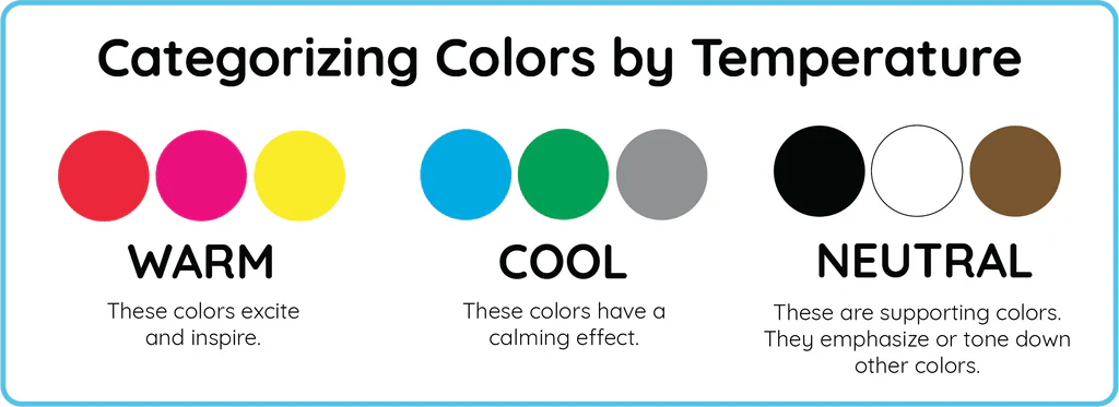
Warm vs. cool tones
Blues and many greens are usually considered “cool.” They often read as clean and steady. Neutrals can lean warm (cream, tan) or cool (some grays). The warm/cool direction matters because it changes the mood even when the color family stays the same.
Saturation and brightness
Two blues can behave like completely different colors. A dark navy can feel formal and structured. A bright cyan can feel energetic and loud. If you want a calm work backdrop, choose lower saturation and medium-to-dark values. If you want more energy, add a small amount of brighter color as an accent.
Contrast and readability
High contrast can feel sharp and clear. Low contrast can feel soft and quiet but may also feel flat. In work settings, aim for contrast where it improves readability (screens, notes, signage) and keep the rest balanced.
Blue at work: focus, trust, and clear thinking

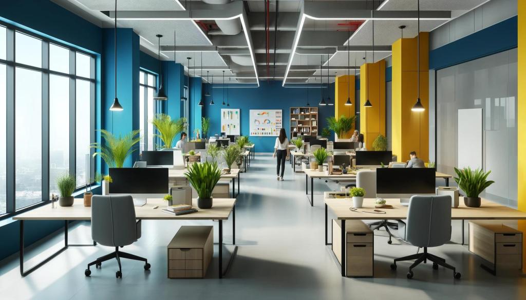
Blue is a strong choice for work because it often reads as stable and straightforward. Many people connect blue with reliability, structure, and calm. That makes it a common pick for offices, studios, and home work zones where focus matters.
Where blue tends to work best
- Deep-focus tasks like writing, analysis, planning, and coding
- Areas where you want a “clean” visual signal: a tidy background for video calls
- Client-facing spaces where you want a confident, professional tone
- Shared work areas that need to feel steady rather than overly playful
When blue can feel too cool
In some rooms, especially those with cool lighting, blue can feel distant. If the space already has a lot of gray, steel, or glass, adding more cool blue may push it into a sterile look. The fix is simple: soften with warm neutrals (off-white, beige), natural textures (wood, linen), or a muted green.
Blue pairings that stay professional
For a classic look, pair navy or slate blue with warm white and a small amount of black. For a lighter feel, pair soft blue-gray with cream and light wood. If you want a creative edge without chaos, add one art piece with a controlled mix of blue plus a small accent color.
Green at work: steady energy and mental reset
Green is often linked to balance, rest for the eyes, and a sense of “freshness.” In work settings, it can support long sessions where you want to stay alert without feeling tense. Green also connects well with natural materials, which helps a workspace feel more human.
Where green tends to work best
- Spaces for long work blocks, especially when you want a calmer pace
- Creative work where you want openness without visual noise
- Meeting areas where you want a friendly tone
- Spaces that feel dry or overly technical and need a softer touch
When green can feel flat
A mid-tone green used everywhere can lose definition, especially under dim lighting. Add contrast with neutrals: cream, charcoal, or crisp white. Or choose a green with a clear direction—either a deeper forest green for a grounded mood or a lighter sage for a softer look.
Green pairings that keep the look clean
Try sage with warm white and tan. Try deep green with cream and black details. If you like a more structured look, pair green with a cool gray, then add one warm element (a wood desk, a warm lamp) so the space doesn’t feel icy.
Neutrals at work: clarity without distraction
Neutrals are the backbone of most work interiors for a reason: they reduce visual clutter and make it easier to focus. The key is choosing neutrals that match your lighting and your preferred mood.
Neutral families to know
- White and off-white: bright, clean, and flexible for backgrounds
- Cream and beige: warmer and softer, good for comfort
- Gray: structured and modern, but can feel cold if overused
- Charcoal and black: strong contrast, best in smaller doses
Avoiding “too much gray”
All-gray rooms can feel heavy or dull. If your walls and furniture are already gray, bring in warmth with cream accents, wood tones, or art that includes blue-green hues. Even small changes can help a room feel more balanced.
How to build a blue–green–neutral palette
A reliable palette has three roles: a main color, a support color, and a background. For work settings, let neutrals do most of the background work, then use blue and green to guide the mood.
A simple palette method
Start with a neutral base. Then choose one “leader” color (blue or green) and one “support” color (the other). Keep the leader color stronger, and use the support color in smaller parts. This keeps the space calm and organized.
Ratio rule that’s easy to follow
Use a neutral base for most of what you see, then add your leader color, then add the support color. If you want an accent, keep it small and purposeful. Too many accents can make a workspace feel busy.
Use wall art to tie it together
Wall art is a practical way to pull colors into a room without repainting. If you want blue for focus but your furniture is warm, choose prints that include blue plus warm neutrals. If you want green to soften a space, choose pieces that mix green with cream, tan, or light gray. A curated set of Abstract Art Prints Collection for Office Walls can make this easy because abstract pieces often blend multiple tones in a controlled way.
Practical ways to apply these colors without repainting
Use canvas prints and wall art as the quickest color shift
If you don’t want to change paint, art is your best lever. One large piece can set the mood, or a small group can add structure. Blue-led art often works well behind a desk because it reads calm on camera. Green-led art can soften sharp lines and add a more relaxed feel. Neutrals help the whole setup look consistent.
If your goal is a professional workspace look that still feels personal, browse the Office Wall Art Collection – Canvas Prints for Workspaces and pick a color direction first, then choose a style that fits your work.
Try smaller changes that support the palette
Once your wall art sets the direction, match small elements to it. A desk mat, notebook covers, lamp shade, or storage boxes can echo the leader color without taking over the room. Lighting matters too: warm bulbs make blues feel softer and neutrals feel more inviting; cool bulbs make whites and grays feel sharper.
Digital background and video-call framing
Your background is part of your professional image. A controlled mix of blue, green, and neutrals helps you look consistent on camera. Place your main art piece where it frames you without crowding your head, and avoid high-contrast patterns directly behind your face.
Common mistakes to avoid
- Using too many strong colors: Pick one main direction and stick with it.
- Ignoring lighting: The same print can look different under warm vs. cool bulbs.
- Choosing brightness over comfort: Very bright blues or greens can feel loud over long hours.
- Overdoing gray: Add warm neutrals or natural materials to keep the room from feeling cold.
- Copying a trend that doesn’t fit your work: Your daily tasks should guide the mood.
FAQ: Blue, green, and neutrals in work settings
Is blue always better for productivity?
Blue often supports focus, but “better” depends on your tasks and lighting. For some people, softer greens are easier for long sessions. Use the color that helps you feel steady, not the one that sounds most “correct.”
Is green better for creative work?
Green can feel open and relaxed, which can help idea work. But creative teams often do best with a stable base (neutrals) plus one guiding color so the space stays organized.
Are neutrals boring?
Not if you use them well. Neutrals create a clean foundation, then blue or green adds direction. Texture also matters: wood, textiles, and paper surfaces keep neutrals from feeling flat.
How do I choose warm vs. cool neutrals?
Look at your lighting and your main furniture. If you have warm wood and warm lighting, warm off-whites and beige often fit better. If you have cool light and metal details, cooler whites and grays can look more consistent.
What if team members react differently to color?
Use a neutral foundation and keep strong color to controlled zones: art, small accents, or one feature area. This keeps the room comfortable for more people.
Closing: a simple plan you can use today
If you want a clear, professional workspace that supports real work, start with neutrals, choose blue for focus or green for long-session comfort, then let wall art pull the palette together. Keep contrast where it helps clarity, and keep strong color under control so the space stays calm. Once your palette is set, small desk and lighting changes will follow naturally.

You must be logged in to post a comment.