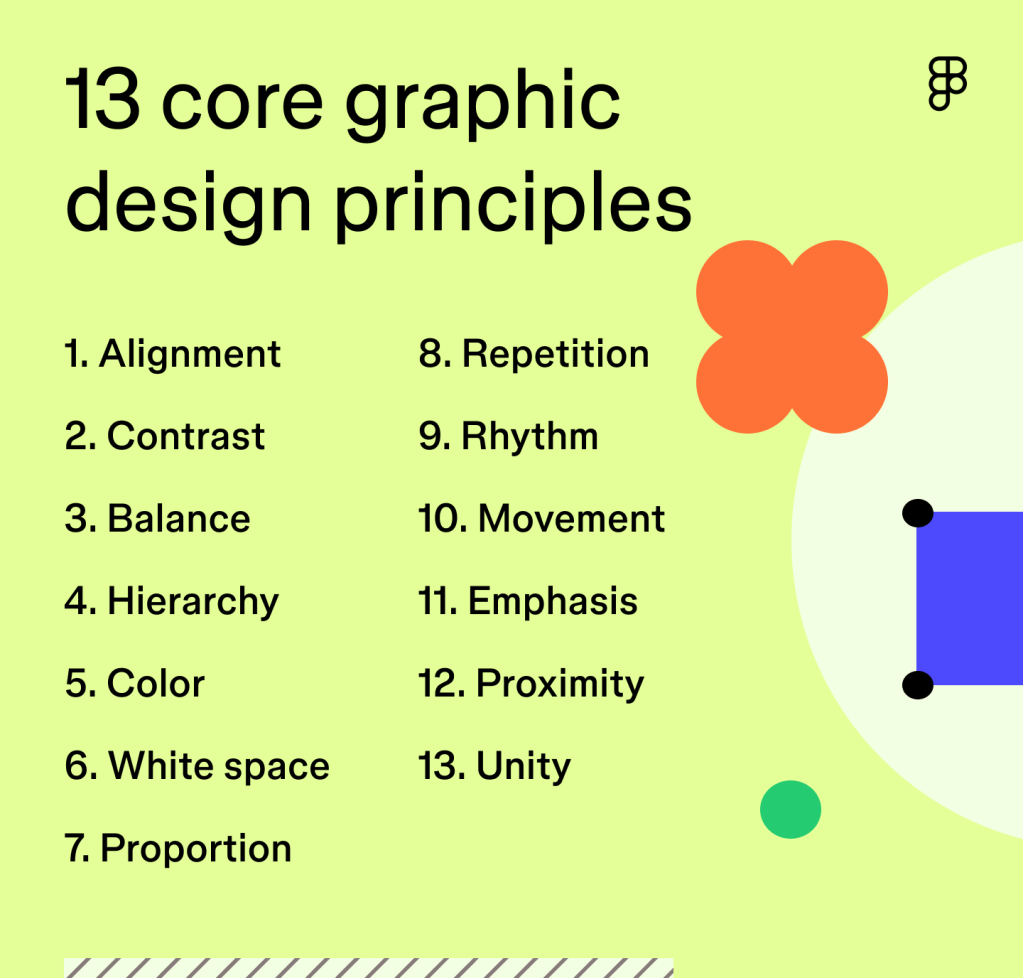
1. Consistency
📌 Maintain uniform formatting throughout the document.
- Use the same font type, size, and spacing for body text.
- Stick to a consistent heading structure (e.g., Heading 1 for titles, Heading 2 for subheadings).
- Align margins, spacing, and list styles uniformly.
🛠 How to do it in Word: Use Styles under the Home tab to apply consistent formatting across all text.

2. Alignment
📌 Align text and objects to create clean, organized layouts.
- Avoid randomly placed text boxes or images.
- Left-align body text for readability (especially for English and similar languages).
- Center-align titles and use consistent paragraph indents.
🛠 Use: Home > Paragraph > Alignment tools or use keyboard shortcuts like Ctrl + L for left-align.
3. Hierarchy
📌 Establish visual importance using font size, style, and weight.
- Title > Heading > Subheading > Body text — make sure each level is clearly distinguishable.
- Use bold or larger font for headers, but don’t overdo it.
🛠 Use: Home > Styles and modify Heading styles to suit your visual needs.
4. White Space
📌 Give elements room to breathe with proper spacing.
- Don’t cram text — use spacing between paragraphs and sections.
- Avoid filling every inch of the page.
🛠 Use: Layout > Paragraph Spacing, and adjust margins in Layout > Margins.
5. Readability
📌 Make your text easy to read at a glance.
- Use clean fonts like Calibri, Arial, or Times New Roman.
- Avoid using decorative or script fonts for body text.
- Keep paragraph length manageable (4–6 lines is a good average).
🛠 Use: Home > Font tools to adjust size and type; aim for 11–12 pt body text.
6. Contrast
📌 Use contrast to highlight key information.
- Ensure there is enough contrast between text and background (especially in colored sections).
- Use bold, italics, or color (sparingly) to emphasize important points.
🛠 Use: Font Color, Bold, and Highlight tools under Home > Font.
7. Visual Balance
📌 Create symmetry and balance across pages.
- Distribute text and images evenly.
- Don’t overload one section of the page while leaving others empty.
- Use columns or tables if needed for balance.
🛠 Use: Layout > Columns, and Insert > Table for structured layouts.
8. Simplicity
📌 Less is more. Avoid clutter.
- Avoid excessive fonts, colors, or effects.
- Stick to 2–3 fonts max per document.
- Don’t overuse borders, clipart, or word art.
🛠 Tip: Stick to professional templates and minimalist design practices.
9. Visual Flow
📌 Guide the reader’s eye logically through the document.
- Use headings, bullets, and numbered lists to break up information.
- Use visual anchors (like images or icons) to help with scanning.
🛠 Use: Insert > Shapes, Insert > SmartArt, and Home > Lists.
10. Accessibility
📌 Design for all readers, including those with visual impairments.
- Use high-contrast text.
- Add alt text to images (
Right-click > Edit Alt Text). - Avoid using color as the only way to convey meaning.
🛠 Use: Review > Check Accessibility to run an accessibility report on your document.
🧾 Final Tips
- Preview your document using Print Preview (
File > Print) to see how the layout translates to paper or PDF. - If designing for professional use, export as a PDF to preserve formatting.
- Use Templates from the Word gallery for a head start with good design.

You must be logged in to post a comment.