
Definition;
In Maths, Statistics is a method of interpreting, analysing and summarising the data. Hence, the types of statistics are categorised based on these features: Descriptive and inferential statistics. Based on the representation of data such as using pie charts, bar graphs, or tables, we analyse and interpret it.
What are the 3 types of statistics?
They are: (i) Mean, (ii) Median, and (iii) Mode. Statistics is the study of Data Collection, Analysis, Interpretation, Presentation, and organizing in a specific way.
Mean;
Mean is an essential concept in mathematics and statistics. The mean is the average or the most common value in a collection of numbers.
In statistics, it is a measure of central tendency of a probability distribution along median and mode. It is also referred to as an expected value.
How to Calculate Mean?
There are different ways of measuring the central tendency of a set of values. There are multiple ways to calculate the mean. Here are the two most popular ones:
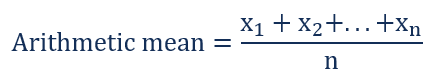
Arithmetic mean is the total of the sum of all values in a collection of numbers divided by the number of numbers in a collection. It is calculated in the following way:
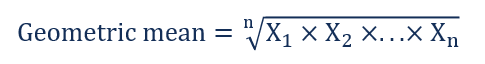
Geometric mean is an nth root of the product of all numbers in a collection. The formula for the geometric mean is:
The geometric mean includes the volatility and compounding effects of returns. Thus, the geometric average provides a more accurate calculation of an average return.
Median;
The median of a set of data is the middlemost number or centre value in the set. The median is also the number that is halfway into the set.
Median Formula
The formula to calculate the median of the finite number of data set is given here. The median formula is different for even and odd numbers of observations. Therefore, it is necessary to recognise first if we have odd number of values or even number of values in a given data set.
The formula to calculate the median of the data set is given as follows.
Odd Number of Observations
If the total number of observations given is odd, then the formula to calculate the median is:
Median = {(n+1)/2}th term
where n is the number of observations
Even Number of Observations
If the total number of observation is even, then the median formula is:
Median = [(n/2)th term + {(n/2)+1}th term]/2
where n is the number of observations
Mode;
In statistics, the mode is the value that is repeatedly occurring in a given set. We can also say that the value or number in a data set, which has a high frequency or appears more frequently, is called mode or modal value. It is one of the three measures of central tendency, apart from mean and median
Mode Definition in Statistics
A mode is defined as the value that has a higher frequency in a given set of values. It is the value that appears the most number of times.
Bimodal, Trimodal & Multimodal (More than one mode);
- When there are two modes in a data set, then the set is called bimodal
For example, The mode of Set A = {2,2,2,3,4,4,5,5,5} is 2 and 5, because both 2 and 5 is repeated three times in the given set.
- When there are three modes in a data set, then the set is called trimodal
For example, the mode of set A = {2,2,2,3,4,4,5,5,5,7,8,8,8} is 2, 5 and 8
- When there are four or more modes in a data set, then the set is called multimodal

Summary Statistics;
In Statistics, summary statistics are a part of descriptive statistics (Which is one of the types of statistics), which gives the list of information about sample data. We know that statistics deals with the presentation of data visually and quantitatively. Thus, summary statistics deals with summarizing the statistical information. Summary statistics generally deal with condensing the data in a simpler form, so that the observer can understand the information at a glance. Generally, statisticians try to describe the observations by finding:
- The measure of central tendency or mean of the locations, such as arithmetic mean.
- The measure of distribution shapes like skewness or kurtosis.
- The measure of dispersion such as the standard mean absolute deviation.
- The measure of statistical dependence such as correlation coefficient.
Summary Statistics Table;
The summary statistics table is the visual representation of summarized statistical information about the data in tabular form.
For example, the blood group of 20 students in the class are O, A, B, AB, B, B, AB, O, A, B, B, AB, AB, O, O, B, A, AB, B, A.
| Blood Group | No. of Students |
| O | 4 |
| A | 4 |
| B | 7 |
| AB | 5 |
| Total | 20 |
Thus, the summary statistics table shows that 4 students in the class have O blood group, 4 students have A blood group, 7 students in the class have B blood group and 5 students in the class have AB blood group. The summary statistics table is generally used to represent the big data related to population, unemployment, and the economy to be summarized systematically to interpret the accurate result.
Scope of Statistics;
Statistics is used in many sectors such as psychology, geology, sociology, weather forecasting, probability and much more. The goal of statistics is to gain understanding from the data, it focuses on applications, and hence, it is distinctively considered as a mathematical science.
Methods in Statistics
The methods involve collecting, summarizing, analyzing, and interpreting variable numerical data. Here some of the methods are provided below.
- Data collection
- Data summarization
- Statistical analysis
What is Data in Statistics?
Data is a collection of facts, such as numbers, words, measurements, observations etc.
Types of Data
- Qualitative data- it is descriptive data.
- Example- She can run fast, He is thin.
- Quantitative data- it is numerical information.
- Example- An Octopus is an Eight legged creature.
Types of quantitative data
- Discrete data- has a particular fixed value. It can be counted
- Continuous data- is not fixed but has a range of data. It can be measured.
Representation of Data
There are different ways to represent data such as through graphs, charts or tables. The general representation of statistical data are:
- Bar Graph
- Pie Chart
- Line Graph
- Pictograph
- Histogram
- Frequency Distribution
 | Bar Graph A Bar Graph represents grouped data with rectangular bars with lengths proportional to the values that they represent. The bars can be plotted vertically or horizontally. |
 | Pie Chart A type of graph in which a circle is divided into Sectors. Each of these sectors represents a proportion of the whole. |
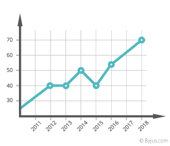 | Line graph The line chart is represented by a series of data points connected with a straight line. The series of data points are called ‘markers.’ |
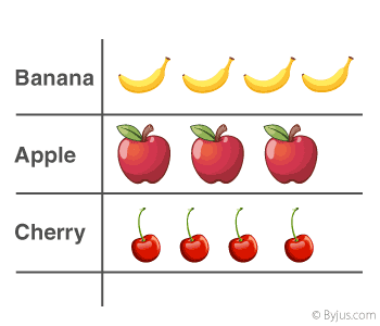 | Pictograph A pictorial symbol for a word or phrase, i.e. showing data with the help of pictures. Such as Apple, Banana & Cherry can have different numbers, and it is just a representation of data. |
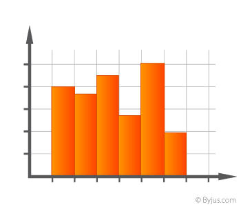 | Histogram A diagram is consisting of rectangles. Whose area is proportional to the frequency of a variable and whose width is equal to the class interval. |
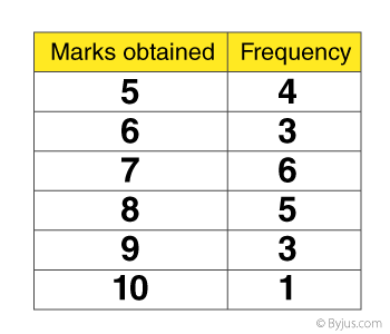 | Frequency Distribution The frequency of a data value is often represented by “f.” A frequency table is constructed by arranging collected data values in ascending order of magnitude with their corresponding frequencies. |

You must be logged in to post a comment.